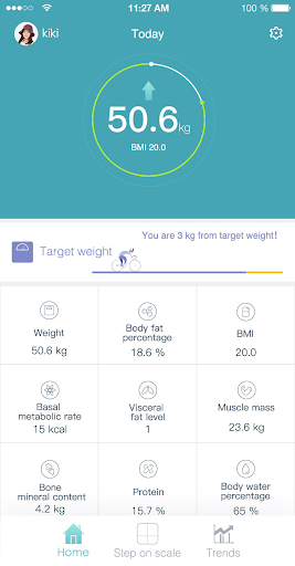
Huawei Body Fat Scale is an app used to manage Huawei's body fat scales. Huawei Body Fat Scale will connect to your scale and provide professional measurement and analysis for you.
fixed bugs


9Apps 4.9