









DOWNLOAD IS NOT SUPPORTED IN WEB STORE!
Use the latest version of 9Apps to download APK&OBB file of games in one click!
DOWNLOAD 9APPS

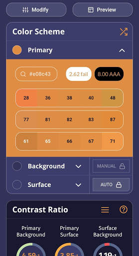
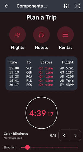
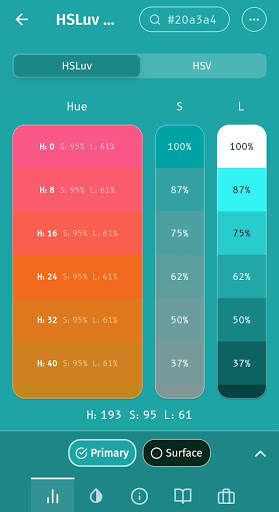
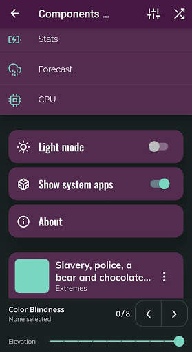
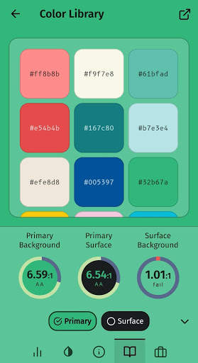
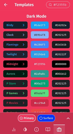
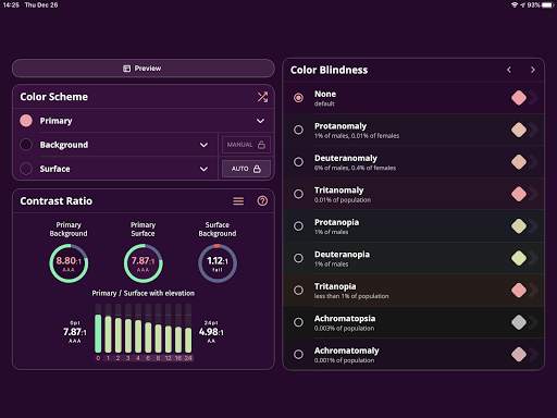
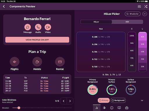
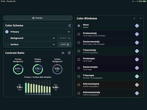
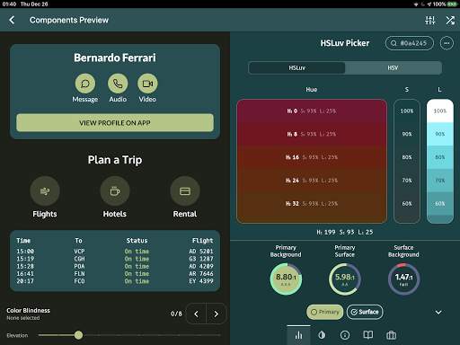
It is hard to choose colors. Most color pickers give you 16 million colors and ask you to pick one. So many options, in fact, that your creativity may get blocked. There is no intuitive way to know which colors will fit your needs. This gets even harder when you deal with multiple colors. Even harder when you want these colors to follow a design specification and form a coherent theme. This project aims to help solve these problems.
This app allows you to play with 3 colors: Primary, Background and Surface. Background and Surface allows you to toggle "auto" mode (by default, when you open the app, it is on for the Background, to help with discoverability). In auto mode, Background follows the [Material Design recommendation](https://material.io/design/color/dark-theme.html#properties): 8% of Primary color + #121212.
Regarding Surface color, there is no official recommendation, so it gets the Background and adds 5% of lightness in HSLuv color space. If Background has 10% of lightness, Surface has 15%.
Web Content Accessibility Guidelines (WCAG) recommends a contrast of:
- 3.0:1 minimum for texts larger than 18pt or icons (AA+).
- 4.5:1 minimum for texts smaller than 18pt (AA).
- 7.0:1 minimum when possible, if possible (AAA).
Material Design follows it and recommends a contrast ratio of 4.5:1 (AA) for body text at all elevations. This project shows all possible elevation variations with their respective contrast to Primary color.
This project is open source:
https://github.com/bernaferrari/color-studio
Custom fonts!


